

Buckman Photos
Rebrand
Buckman Photos
Eric Buckman, of Buckman Photos, is a Pittsburgh-based freelance photographer. He specialized in wedding and portrait photography. Eric came to me with the goal of developing a strong brand that portrays his style accurately and attracts clientele.

Develop a Strong Logo
Solidify Brand Voice
Create a Cohesive Color Palette
Goals


Logo
My goal when creating the logo for Buckman Photos was to ensure it created a clean, strong, and refined feeling. After going back and forth for some time, we decided to use the full profile of a buck, as opposed to the antlers. The buck profile demonstrates the strength and resilience of the brand. The typography was chosen to play on the refined, classic look that we were striving for.


Brand Colors
When developing new brand colors, it was essential to capture the style of Eric’s work. In order to encapsulate this, I chose hex colors directly from his photography. Pulling colors from Eric’s photos, I was able to develop a full color scheme that accurately represented his style. The brand colors I chose work well together in many aspects, including portraying the tone and imagery we wanted to incorporate.
Tone
The tone of Buckman Photos was chosen based on the audience as well as the previous brand personality. It was essential to display Eric’s voice prominently while refining the copy to work toward a specific goal. The tone of Buckman Photos previously was optimistic, intense, and philosophical. Keeping the personality of the brand while making it sincere and nostalgic. This was essential in attracting the desired clientele and building an online community.
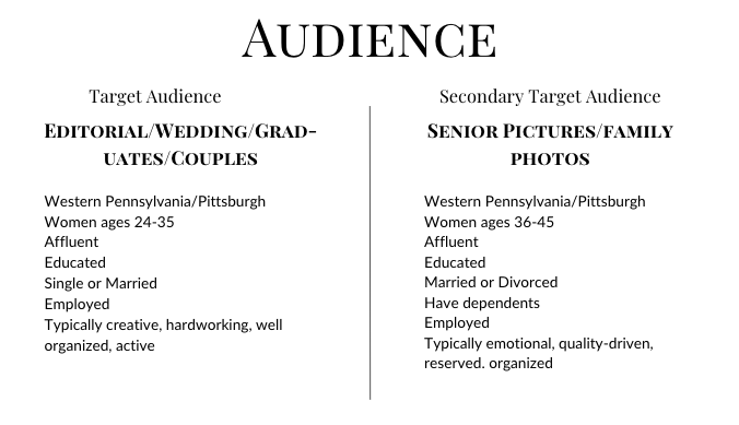
Redefining Audience
xx
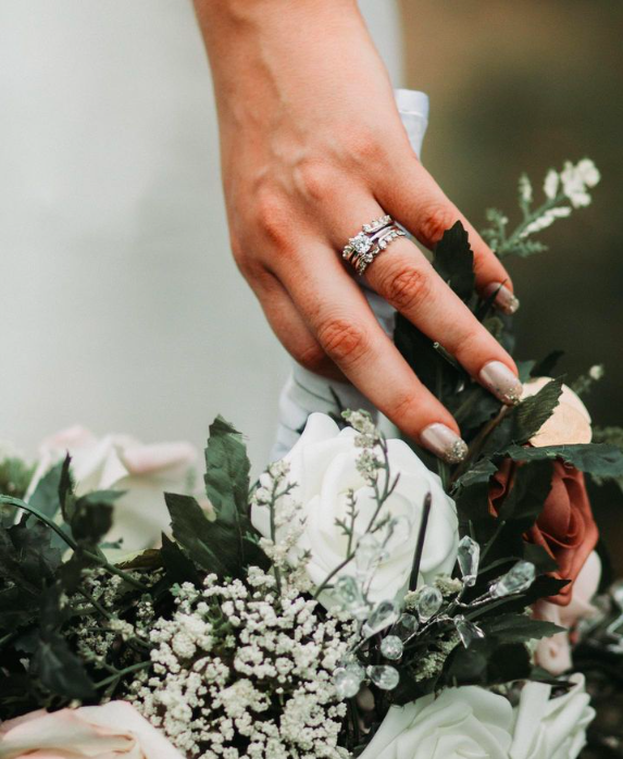
Imagery
xx


Social Media
Consultation
When creating content for Lilac Honey, we wanted to incorporate plants into almost every photo. This stylistic choice was essential in making the images more attractive and bringing life into them. In